Start
- package.json 에 다음과 같이 명령어를 넣는다.
  "scripts": {
    "dev": "vite",
    ...
    "preview": "vite preview",
    "storybook": "storybook dev -p 6006"
},- 다음 명령어를 통해 Storybook 을 실행할 수 있다.
npm run dev:storybook- http://localhost:3003 로 Storybook 이 자동 실행 된다.
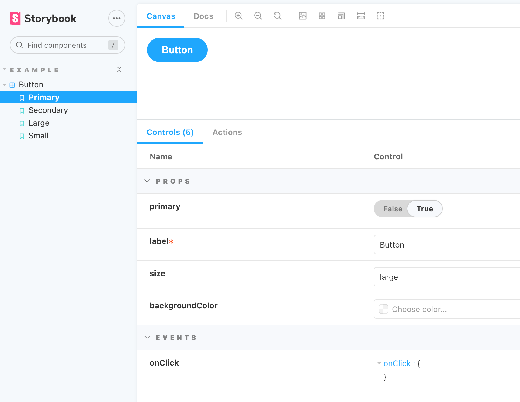
Button Example
1. Button Story 를 추가해봤다.
2. 전체적인 코드를 먼저 대략적으로 말하자면, Button Component 에서 label, primary 여부, size, backgroundColor 를 props 으로 받고 click 이벤트를 세팅했다.
- 스토리 포맷의 세부 내용은 다음과 같다. 기본적으로 스토리를 만들기 위해서는 title, component, template 이 있어야한다. 다음은 primary 스토리를 만든 예시이다.
import CommonButton from './CommonButton.vue';

export default {
  title: 'Example/Button',
  component: CommonButton,
};

export const Primary = () => ({
  components: { CommonButton },
  template: '<CommonButton primary label="Button" />',
});
- title 은 Storybook 의 tree 구조 및 라이브러리와 스토리 이름을 정할 때 사용한다.

- component 는 미리 보려하는 구성 요소를 뜻한다.
- template 은 말 그대로 사용할 컴포넌트 템플릿을 만들 때 사용한다. 자유롭게 인자를 지정하여 여러개의 스토리를 만들 수도 있다.
3. 자유롭게 인자를 지정하기 위해서는 args 와 argTypes 를 이용하면 된다.
import CommonButton from './CommonButton.vue';

export default {
  title: 'Example/Button',
  component: CommonButton,
  args: {
    backgroundColor: '#000'
  },
  argTypes: {
    backgroundColor: { control: 'color' },
  }
};
...
- args 는 모든 스토리에 공통으로 전달될 props 를 말한다. 예를 들어 위와 같이 설정 했을 경우 모든 스토리에 공통으로 backgroundColor 가 검정색으로 전달이 된다.
- argTypes 는 각 스토리 args 의 행동(behaviour) 방식을 설정한다. 예를 들어 위와 같이 설정 했을 경우 Controls 에서 선택한 색상을 bacgroundColor 에 적용할 수 있도록 props 를 전달하겠다는 의미이다.

4. 그 외 decorators, parameters, excludeStories 등 이 있다.
- decorators : 스토리를 래핑하는 추가 랜더링 기능
- parameters : 스토리에 대한 정적 메타 데이터 정의
- excludeStories : 랜더링 제외 설정
5. 다음은 args 와 argTypes 를 이용해 여러개의 스토리 template 을 만든 코드이다.
...
const Template: any = (args: any, { argTypes }: any) => ({
  props: Object.keys(argTypes),
  components: { CommonButton },
  template: '<CommonButton v-bind="$props" />'
});

export const Primary = Template.bind({});
Primary.args = {
  primary: true,
  label: 'Button',
};

export const Secondary = Template.bind({});
Secondary.args = {
  label: 'Button',
};

export const Large = Template.bind({});
Large.args = {
  size: 'large',
  label: 'Button',
};

export const Small = Template.bind({});
Small.args = {
  size: 'small',
  label: 'Button',
};
6. 위에서 만든 CommonButton Component 의 스토리를 만들어봤다.
import CommonButton from './CommonButton.vue';

export default {
  title: 'Example/Button',
  component: CommonButton,
  argTypes: {
    backgroundColor: { control: 'color' },
    size: {
      control: { type: 'select' },
      options: ['small', 'medium', 'large'],
    },
  }
};

const Template: any = (args: any, { argTypes }: any) => ({
  props: Object.keys(argTypes),
  components: { CommonButton },
  template: '<CommonButton @click="onClick" v-bind="$props" />'
});

export const Primary = Template.bind({});
Primary.args = {
  primary: true,
  label: 'Button',
};

export const Secondary = Template.bind({});
Secondary.args = {
  label: 'Button',
};

export const Large = Template.bind({});
Large.args = {
  size: 'large',
  label: 'Button',
};

export const Small = Template.bind({});
Small.args = {
  size: 'small',
  label: 'Button',
};